Pilates Booking Journey
KX Pilates is an Australian reformer pilates company with over 90 studios across the country.
During the User Experience Design course at RMIT University, I explored how the KX Pilates website could be improved, using UX methods to re-design the product to be more useful, usable, and valuable.
Capabilities
UX Design, User research, User interviews, Affinity mapping, User flows, Ideation, Sketching and wireframing, Concept design, Usability testing and iteration, Prototyping
Sector
Wellbeing
Tools
Figma, Miro
The Problem
KX Pilates customers might find it difficult to book a class because the class schedule is difficult to find on the website.
It was common for users to feel that the website was confusing to navigate and that it took too long for them to find the key features they required, such as managing their bookings (pack expiry date, number of classes remaining on current pack), and logging in to access their account details.
Primary Goals
Support KX Pilates customers’ need to easily and quickly access the main content they require when using the website.
Enhance the overall user experience by improving the user flow.
Help users find the class schedule and book into a class quickly and easily.
Help users login to their account quickly and easily, to view how many classes they have remaining in their current pack and when it expires.
The Design Process
Identify a UX design challenge — I was required to explore a hunch within an existing digital product, and redesign the user flow, to improve the product’s user experience. After selecting KX Pilates’ desktop website, I defined a problem statement and mapped out the current user flow for review.
User research — To validate this hunch, I used desktop research and landscape reviews to evaluate competitors and gain insights. I conducted user interviews with existing customers, and synthesised the findings using affinity mapping. I then selected the top priority insights, turned them into opportunities, and developed recommendations to inform the design.
Ideation — I used sketching, crazy 8s and storyboarding to generate ideas that addressed these insights, and used a prioritisation framework to establish which solutions to develop further.
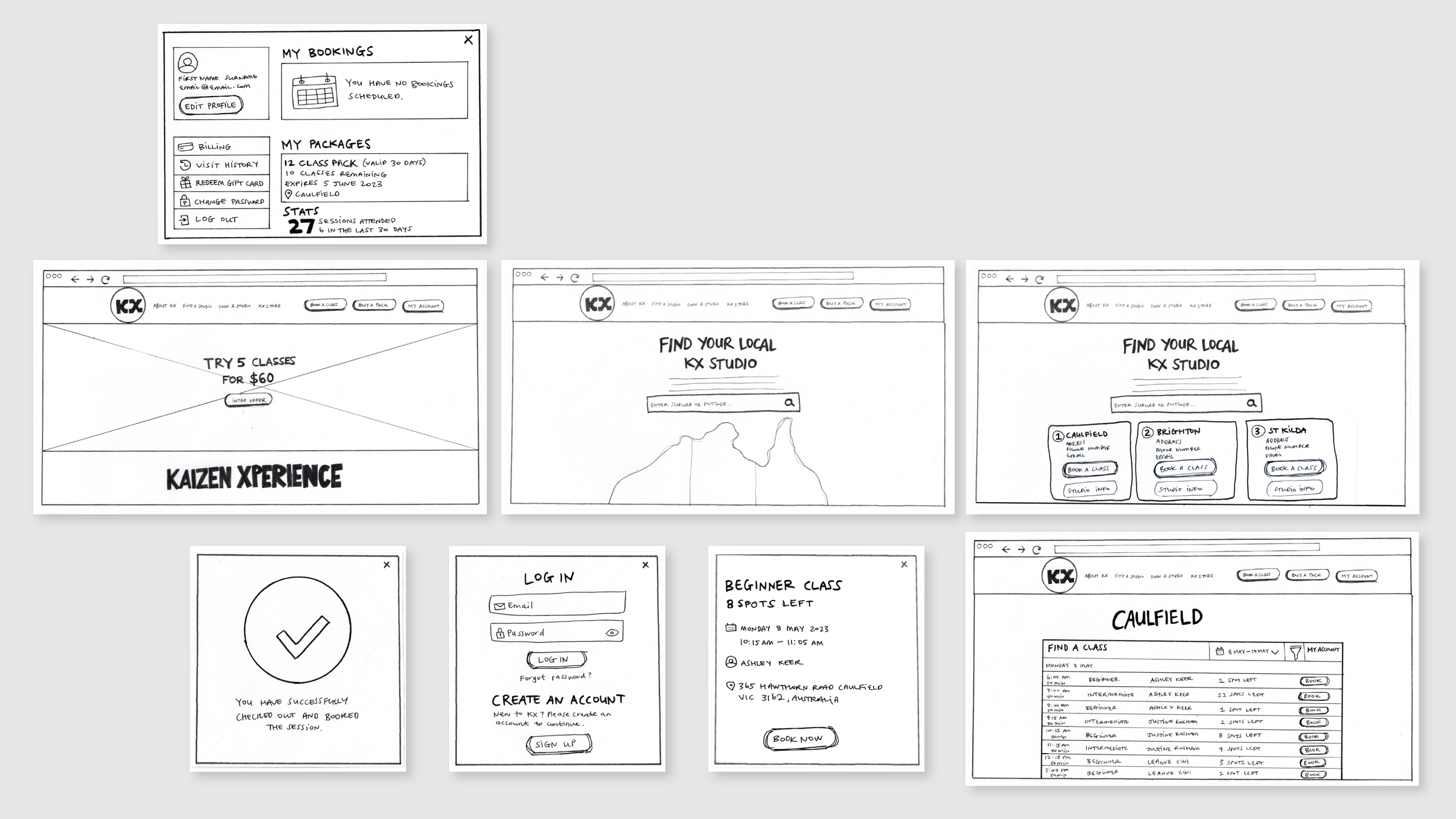
Concept design & low-fidelity prototyping — I created a new and simplified user flow and a low-fidelity paper prototype to perform usability testing.
Usability testing & iteration — I developed an interview guide and conducted moderated usability testing on my prototype. I then synthesised the findings using affinity mapping to inform further iteration of my design and the user journey.
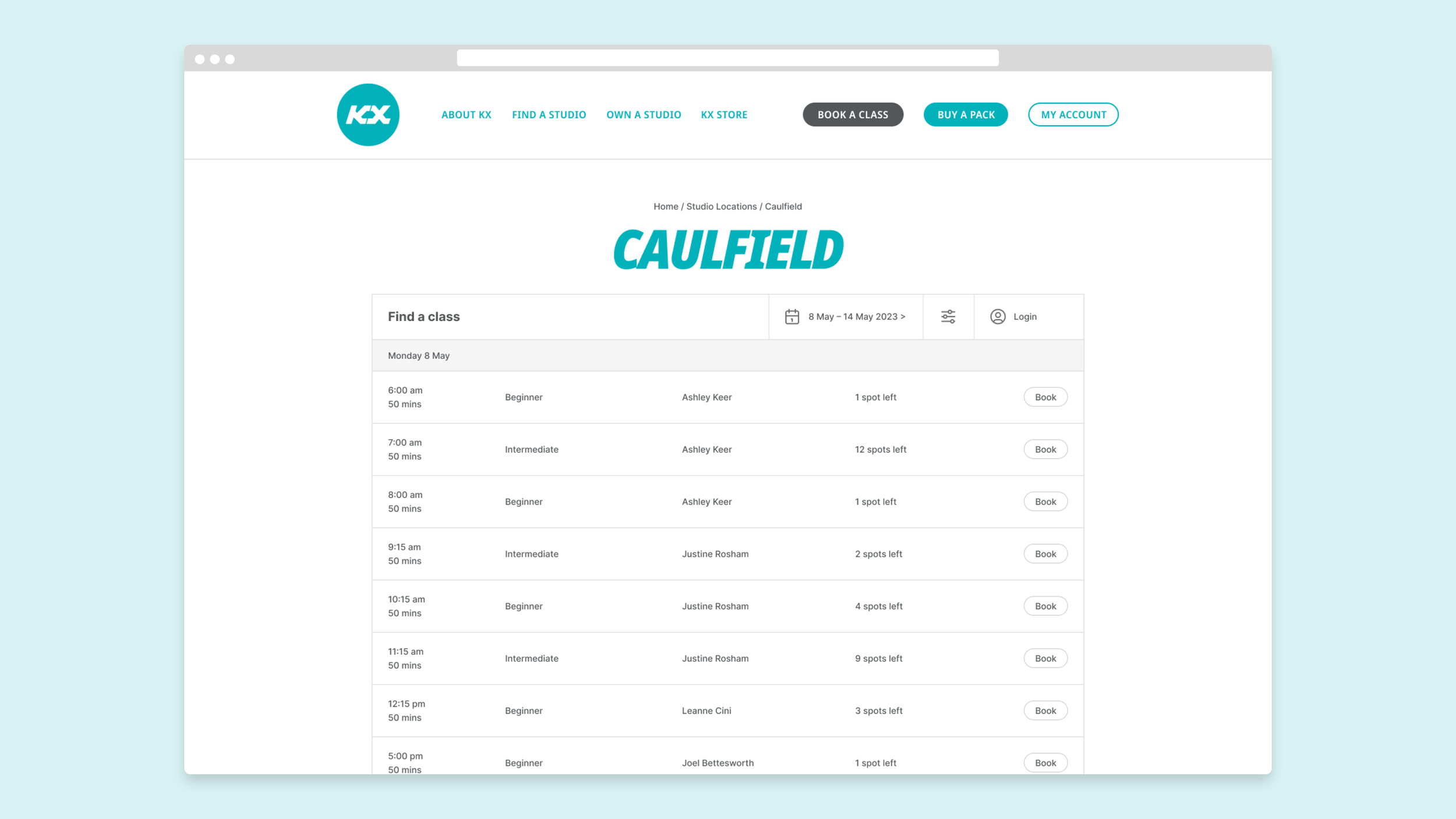
Medium-fidelity prototyping — I used Figma to produce a clickable medium-fidelity prototype which incorporated the user testing feedback. The final design aimed to improve the product’s user experience and resolve issues with the existing user flow that I chose to explore.


User Interviews & Affinity Mapping
I conducted user interviews with four KX pilates customers which focused on:
Booking into a pilates class on the website.
Logging into their account to view their current pack details.
The main purpose was to understand the user’s goals, behaviours, needs and feelings when using the existing website.
After capturing each user’s feedback, I used affinity mapping to synthesise the findings and establish key themes and common pain points. I then turned the three top priority insights into action for design.
Opportunities
How might we reposition the class schedule for customers so that it can be found easily and quickly?
How might we redesign the login experience for customers so that it is quick and easy to access?
How might we redesign the main menu navigation for customers so that it includes the key actions they require?

Ideation
Based on the user insights and desk research, I used sketching, crazy 8s, and storyboards to brainstorm and quickly generate various ideas.
Prioritisation
I then used an effort vs. impact matrix to prioritise which concepts would be designed into a low-fidelity prototype.
Simplify steps to view the class schedule and book a class.
Improve the login experience so users can find where to access their current pack details and information.

Paper Prototyping
I designed a low-fidelity paper prototype and improved user flow, to perform usability testing to gain further insights.


Opportunities
How might we re-order the user flow for customers so that the steps to book a class feel natural and clear?
How might we redesign the final confirmation screen for customers so they can easily view their booked classes or log out of their account?
How might we redesign the ‘my packages’ section for customers so that it’s clearer for them to see how many classes they have remaining on the current pack?
How might we redesign the ‘my account’ dashboard so customers can book a class and/or buy a pack directly from there?
Usability testing and iteration
To validate this concept, I conducted moderated usability testing with three current KX pilates customers using the low-fidelity paper prototype. Feedback from these participants successfully validated the product concept, while also highlighting further opportunities for iteration of the design.
User flows and wireframing
Based on the usability testing feedback, I mapped out an improved user flow of the website and started building wireframes of the designs in Figma, taking the interview participants’ key desires into consideration.

Home Page

Find A Studio

Studio Search Results

Studio Timetable

Log In

Selected Class Confirmation

Booking Confirmation

My Account Dashboard
High-fidelity prototype
I created a clickable high-fidelity prototype of my design to improve and resolve issues with the current digital product and user flows.
Project completed in 2023 during the User Experience Design course at RMIT University.
Selected work
The Four “M”s
Moving to Mars
NLC Rebrand
Schroders TV


